These are the original images for my ancillary texts.
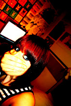
The first two images were taken up against the wall in the bedroom that was used in the bedroom scene within the music video. By using the same location for the music video and ancillary texts I am ensuring continuity, also this means there will be very similar lighting maintaining the same warm lighting effects in both the music video and ancillary texts. With this first image i flipped it vertically so that she was looking up to the left and used it as the right panel on the inside cover if the digipak.

The second image is located on the left hand panel for the inside cover. These would work as the two girls that frame the 'doodles' as shown in the planning/sketched ideas for the digipak. In order to strengthen these images i played with the brightness, saturation and contrast of the two images. To smooth the facial detail and make it almost seem as though the image has been sketched i used the 'dust and scratches' filter with a raduis of 14 pixels. But so as to avoid losing the detail on the eyes, earrings and lips i used a combination of the selection tool and layering to copy the original versions of these areas of the image to an above layer so that they weren't affected by the 'dust and scratches' filter. Then to ensure good quality i used the eraser tool on different strengths to tidy up any visible changes in texture between the two sets of images. To further perfect the images and to make the girl look more 'perfect' i used the clone stamp tool to copy clear areas of skin over blemishes and the bags under her eyes.

Finally in order to follow the plan I initially created I cropped the images slightly
so just over half her face was visible on each image.
The following two images were for use on the outside panels of the digipak. This image is the image to be used on the front cover. I have pulled away from the original plan for my front cover and back panel as I thought it would be a better idea to keep the locations the same as the locations in the video for continuity and to strengthen the Ruth Bewsey 'brand'.
Therefor I took this image with the the front cover of Tristan Prettyman's album 'Hello...x' in mind. I liked the idea of personalising the album to the audience through the simple placemem

ent of artist
name and album title in the direction of the artists mouth. So i took this image ensuring that the main detail was on the right third so that there would be room to place the artist name and title along the left and centre thirds. In order to smooth the image and increase the quality i once again played with brightness, contrast and saturation and used the clone stamp tool to perfect the skin quality. I also used a light filter to bring out the detail on the artists hair and face and to also dim the background so that the artists face was a strong centre of focus.
The image with the inclusion of the guitar, amp and suitcase follows the initial sketch/plan. I wanted to include props used in the video so as to increase continuity, also the guitar is an iconic image that the target audience aspire to.
The lighting in the drama studio was fantastic and made the quality of this image really good. The only problem i encountered was that by taking the image side on the dimensions did not fit the required dimensions of the 12.4x12.4cm panel and i really needed the main detail to be on the right third of the image so that the 'thank you speech' could be shaped around the left of the image. Therefore to fix this issue i had to use the clone stamp tool to draw the background across to the left, this was tricky as I had to draw in some of the suitcase and there was a huge risk of this looking badly photoshopped and clearly not real, so it took a lot of time and effort but with a lot of tweaking i managed to make the canvas fit the dimensions without stretching the image or damaging the quality. In order to make sure that the shading and warmth of the image was the same as that of the front cover i once again had to alter brightness contrast and saturation slightly.

These images are scans of the original hand drawn images that were to be used on the CD and in the inside centre panel. Once scanned in i opened the images up in photoshop and cut out each individual picture into a new layer. Once each in a new layer i took a sample of the yellowish background colour from the right panel with the eyedropper tool and with the paint bucket tool i filled in the white areas with this, i left some areas white as it gave the images a varying texture. Once i had done this with each image i could copy the layers on to the blank canvas that i had for the centre third and through the use of the 'free transform' tool i could resize and play with the angle/perspective of each image until they were framed on the page in a way i liked. This was probably the most time consuming part of the digipak making process but when it was done i think it worked perfectly.
I also used the flower flourishes across each of the outside panels, i altered the colour/opacity of them to fit each panel as
i wanted. This created an ongoing theme to the digipak.

Finally on every panel i used a sandy texture and altered the opacity of the image and placed it on the top layer on each photoshop file for each panel. This gave the digipak an earthy texture and also emphasised the natural/beach theme created throughout.

For my magazine advert I used the image from the right inside panel of the digipak. In order for it to fit into A4 dimensions i cropped the image, taking away her shoulder and some of the negative space on the left third of the image. With this the girls face takes up the centre and right thirds of the image, leaving the left third to hold information. I also copied the sand texture onto the image to keep up continuity and make the advert aesthetically pleasing. On a new layer I copied the NME logo from the website and modified it to get rid of any white background around the logo using the magic selection tool. I also copied a white star off of the internet with a black outline and modified it using the paint bucket tool to make it a matching red to that of the NME logo. I then duplicated the star four times and spaced them equally apart cantred above the NME logo. Above this i placed a quote to appear as though it was from NME magazine saying 'An andgelic voice. Not to be missed' and 'OUT MARCH 10th'. For both sets of writing i used relatively plain fonts as I wanted them to appear neutral, easy to read and to not draw too much attention away from the main title. The black font colour against the sandy background popped out well and made the information very easy to read. I centred these two pieces of text to keep the layout neat and tidy. For the artist and album title i used the same font styles and colours used in the digipak. I placed them at the top of the picture and made the artist name the width of the A4 page, this way it captures the audiences attention. I then placed the album title underneath this but slightly smaller so as to avoid cramping the piece, also as it is quite a short title if i stretched it to the width of the advert it may look over stretched and unnatural. So i placed it below with the same size font as the artist name and centred it beneath so as to keep the balance even on each side and to further give an overall 'neat' feel to the advert.
 MAGAZINE ADVERT
 OUTSIDE RIGHT PANEL (FRONT COVER)
 OUTSIDE CENTRE PANEL (TRACK LISTING)
 OUTSIDE LEFT PANEL (THANK YOU's)
 INSIDE RIGHT PANEL
 INSIDE CENTRE PANEL
 INSIDE LEFT PANEL
 The second image is located on the left hand panel for the inside cover. These would work as the two girls that frame the 'doodles' as shown in the planning/sketched ideas for the digipak. In order to strengthen these images i played with the brightness, saturation and contrast of the two images. To smooth the facial detail and make it almost seem as though the image has been sketched i used the 'dust and scratches' filter with a raduis of 14 pixels. But so as to avoid losing the detail on the eyes, earrings and lips i used a combination of the selection tool and layering to copy the original versions of these areas of the image to an above layer so that they weren't affected by the 'dust and scratches' filter. Then to ensure good quality i used the eraser tool on different strengths to tidy up any visible changes in texture between the two sets of images. To further perfect the images and to make the girl look more 'perfect' i used the clone stamp tool to copy clear areas of skin over blemishes and the bags under her eyes.
 Finally in order to follow the plan I initially created I cropped the images slightly
 These images are scans of the original hand drawn images that were to be used on the CD and in the inside centre panel. Once scanned in i opened the images up in photoshop and cut out each individual picture into a new layer. Once each in a new layer i took a sample of the yellowish background colour from the right panel with the eyedropper tool and with the paint bucket tool i filled in the white areas with this, i left some areas white as it gave the images a varying texture. Once i had done this with each image i could copy the layers on to the blank canvas that i had for the centre third and through the use of the 'free transform' tool i could resize and play with the angle/perspective of each image until they were framed on the page in a way i liked. This was probably the most time consuming part of the digipak making process but when it was done i think it worked perfectly.
 Finally on every panel i used a sandy texture and altered the opacity of the image and placed it on the top layer on each photoshop file for each panel. This gave the digipak an earthy texture and also emphasised the natural/beach theme created throughout.