MAGAZINE ADVERT
 OUTSIDE RIGHT PANEL (FRONT COVER)
 OUTSIDE CENTRE PANEL (TRACK LISTING)
 OUTSIDE LEFT PANEL (THANK YOU's)
 INSIDE RIGHT PANEL
 INSIDE CENTRE PANEL
 INSIDE LEFT PANEL
MUSIC VIDEO

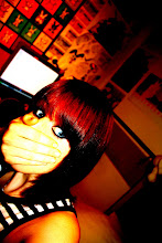
 The second image is located on the left hand panel for the inside cover. These would work as the two girls that frame the 'doodles' as shown in the planning/sketched ideas for the digipak. In order to strengthen these images i played with the brightness, saturation and contrast of the two images. To smooth the facial detail and make it almost seem as though the image has been sketched i used the 'dust and scratches' filter with a raduis of 14 pixels. But so as to avoid losing the detail on the eyes, earrings and lips i used a combination of the selection tool and layering to copy the original versions of these areas of the image to an above layer so that they weren't affected by the 'dust and scratches' filter. Then to ensure good quality i used the eraser tool on different strengths to tidy up any visible changes in texture between the two sets of images. To further perfect the images and to make the girl look more 'perfect' i used the clone stamp tool to copy clear areas of skin over blemishes and the bags under her eyes.
 Finally in order to follow the plan I initially created I cropped the images slightly
 ent of artist
 These images are scans of the original hand drawn images that were to be used on the CD and in the inside centre panel. Once scanned in i opened the images up in photoshop and cut out each individual picture into a new layer. Once each in a new layer i took a sample of the yellowish background colour from the right panel with the eyedropper tool and with the paint bucket tool i filled in the white areas with this, i left some areas white as it gave the images a varying texture. Once i had done this with each image i could copy the layers on to the blank canvas that i had for the centre third and through the use of the 'free transform' tool i could resize and play with the angle/perspective of each image until they were framed on the page in a way i liked. This was probably the most time consuming part of the digipak making process but when it was done i think it worked perfectly.
 Finally on every panel i used a sandy texture and altered the opacity of the image and placed it on the top layer on each photoshop file for each panel. This gave the digipak an earthy texture and also emphasised the natural/beach theme created throughout.
 ngs, this will promote the artists image, and in this style it will promote it positively avoiding objectification. Also in the style of Tristan Prettyman's cover for her album 'Hello...x' I have placed the artist name and title beside her face as it will appear as though she is speaking her album title. The artist name may end up in another placing on the front cover if there is a lack of space and the two titles look cramped together, but the album title will stay in the planned area. The artist name will be written in a clear, printed yet delicate font to keep it easy to read but that will reflect the delicate feel of the artist and her music. The album title on the other hand will be in a font that appears hand written, once again adding to that personal feel, and will be decorated with a small hand drawn flower flourish, this will become a type of signifier throughout the digipak that will be found on most panels and would be something that would be used on future albums, adverts merchandise etc. to create an identity for the artist.
 y have an insight into the artists personal life, ultimately giving them the impession that they feel a stronger personal connection to the artist. This idea i took from the Jason Mraz album 'We Sing. We Dance. We Steal Things.' To further emphasise the impression that these drawings are the artists own thoughts I decided to use photo images of the artist at both the left and right, framing the drawings, these images will be one half of her head each on each side, therefore it will appear as though these 'thoughts' are streaming directly out from her head. This is the reason for the requirement of 3 panels, as they wouldn't fit well on a two panel digipak without the 'thought' section being separated by a fold crease. The CD will slip in a pocket inside the centre panel of the digipak. This way it won't corrupt any of the album art. On the CD there will be hand drawn flower flourishes like what will be found throughout the digipak, it will also contain scribbles much like those found on the inside of the digipak alongside the artist name and album title.


Without looking at the format in which the albums come in and focussing entirely on the cover art and putting them all in a collage like this I can clearly see a pattern emerge in the styles. The majority of the images have a very warm, earthy colour palette or the images represent nature and the earth for instance the moth on the Ani DeFranco album ‘Evolve’ which is pictured third down on the left. Another example is Poi Dog Ponderings self titled album (two across from the Ani DeFranco album) which pictures an abstract cartoon image of a tree with skeletons representing the roots and trunk of the tree, also on the image there is a drawing of an eye, other flowers, a bird and a human silhouette.
16/27 of this selection of cover art contains the artist on the cover, showing that the majority use this to promote the image of the artist as opposed to art reflecting their music. This may be something to consider when planning my digipak, although from looking at these images I personally find the covers not focussing on the artist are much more interesting and aesthetically pleasing, this is also something to consider.


For my artist I am aiming towards creating a form of digipak as opposed to the bog-standard jewel case because I feel a digipak is much more exciting with the potential to be a great keepsake and something that can be much more personal to the artist making the consumer feel as though from purchasing this they have purchased a special part of the artists mind, and it is just generally far more artistic. This digipak for Imogen Heaps album ‘Speak for Yourself’ I think has a combination of good and bad points that I can learn from. For instance, I don’t like how heavily the album promotes the artist with every cover consisting of an image of her. But what I do like about the digipak is the colour scheme and how it reflects her music. The front cover is mainly white but it contains lots of colourful pink, yellow and blue spots surrounding the cartoon image of her, and this is similar on the CD but with horizontal lines as well as spots. This keeps the picture crisp and clean yet upbeat, this reflects the fresh feel-good and optimistic feel of her music. Then the back cover contains a red/pink/yellow colour palette and gives a very warm feel, it reminds me of a sunset, in a way this also reflects her music as it is soothing much like a sunset. All so a sunset represents the end which I like as the back cover is literally the end of the digipak. The one thing I like most about this digipak though is the way the booklet is held. The front cover of the booklet is a picture of Heap riding a bike, once again the colour scheme is very warm, but I like the way it is slotted into the cover and together they make a bigger image revealing more of the bike.


This is another digipak, for the album ‘We Sing, We Dance, We Steal Things’ by Jason Mraz. This digipak is quite different from the previous. Firstly the colour scheme is entirely black and white, there is no photography included at all. All images are hand drawings created by the artist himself. This puts a personal spin on the album that I think the consumers would appreciate as it makes them feel they have a personal insight into the artist’s life and mind. There is also a limited edition version of the album containing a bonus CD and DVD containing 10 of the albums songs unrefined when they were originally recorded for an EP including other songs that didn’t make the album, the DVD contains his full live concert, and these extras give the consumer an even deeper personal touch. The hand drawn cartoons and sketchy writing I think reflects Mraz’s music perfectly, it’s very quirky, cheeky and raw as is his music. The front cover is extremely simple which not many artists could pull off, but it works solely for the fact that his music has enough personality that the album doesn’t need a complex design to make up for any lack of. What this digipak tells me is that in order to make it successful it needs to show the artists personal style as closely as possible.