Monday, 3 May 2010
Wednesday, 24 March 2010
Updated Ancillary Texts Video


Tuesday, 23 March 2010
Revised Updates of Ancillary Texts
The final edit I made was to shrink the artist name and album title on the magazine advert as I felt it covered too much of the width of the advert with no room around the edges, by shrinking it slightly it just made it appear neater and more succinct.


Sunday, 21 March 2010
Wednesday, 17 March 2010
Question 2: How Effective is the Combination of Your Main and Ancillary Texts Revised and Restructured
 e target demographic for Ruth Bewsey is mainly female orientated, with teenage girls of a similar age to the artist looking up to and aspiring to her. Because of this the aim has always been to give the artist a positive representation and make sure she is a good role model for aspiring young girls. This is a breath of fresh air from the many deprecating, ‘sexy’ manufactured girl bands out there that girls are looking to for inspiration and getting the wrong impressions. With my music video and ancillary texts I want to show these girls that in order to be a strong self-empowered and ‘sexy’ woman you don’t need to be scantily clad with little left to the imagination.
Because my target audience is principally female it is important that my video and ancillary texts have a femininity about them so as to appeal to this audience. In order to do this I focussed on using summery, pretty dresses in the music video that made the actress look delicate and elegant, they also complimented her figure without showing a lot of skin. The dress seen in the performance element of the video is the same dress that is used in all the photography for the outside panels of the digipak, this creates a visual link and increases continuity between the two texts. This is further backed up by the fact that the photographs were take
 n in the same studio with the same soft lighting and the inclusion of props found in the music video, this begins to set up a ‘brand’ image as the same visual style is found throughout the different media products. The use of soft lighting in both the video and the photography for the outside panels also reinforces the idea of femininity as it gives a delicate ambience and reflects the softness of her voice and her as a personality. Also on the digipak I have used art in the form of hand drawn flowers as a symbol for femininity as flowers are beautiful and delicate and often relate to women in society for instance they are often bought as a gift for women but not so much for men. As well as a flower being feminine it also is a natural plant that grows from the earth therefore it is also a symbol for naturalism which leads me on to my next point.
As I stated earlier I wanted to create a positive representation of the artist and make her a positive role model for her aspiring target audience. Media is very influential on young girls today and it is renowned for being extremely voyeuristic and constantly producing unhealthy
 ideas of the ‘perfect’ woman being size zero with fake body enhancements and painted faces. This has made a lot of girls (that fall into my target demographic) insecure and constantly strive to become something that doesn’t exist. It is because of this that I want to keep the representation of my artist very down to earth and natural. I have achieved this within my music video through her actions, the character is seen dancing, singing into a hairbrush, putting on her make up, having fun and packing for a new beginning, these are all fun activities that young girls can relate to, but these are also all natural and healthy activities, and
 they show the audience that letting go, having fun and most importantly being yourself makes you feel good as opposed to trying to change yourself and trying to grow up too fast just to feel independent. This ‘natural’ and ‘relaxed’ representation is carried through into my ancillary texts by the use of photography and colour scheme. The photography on the inside panels of the digipak and on the magazine advert are close ups focussing on the artists face, she is wearing little make up and the photographs have not been edited beyond recognition to ‘beautify’ her, she is kept natural and ‘real’. The colour scheme also reinforces this, with the soft sandy warm tones it backs up the relaxed feel created in the video and adds to the purity of the expression seen on her face.
The natural and relaxed representation is not only something that I wanted for my artist as a good role model for her audience, but it is also a convention of the folk genre. My artist is pop/folk, by having her cross between the two genres she is more accessible to a broad audience, having the pop element keeps her mainstream but the folk element keeps that soft feminine natural feel. In my video I used ‘fun’ pop elements such as the shot of the colourful balls, by having a performance narrative alongside a story narrative also follows conventions of the pop video and it keeps the audience engaged as they want to find out what happens in the story. But with the performance element in order to keep to the natural folk feel we set up th
 e studio to be as basic as possible with just a microphone, a guitar and an amp, and there was just the singer and the guitarist, we had the guitarist sitting on a stool to add to the ‘relaxed’ atmosphere and had shots of them talking and laughing together showing their close friendly relationship which I think is important in creating that down to earth simplicity that the folk genre represents. To bring the folk feel through into the digipak and magazine advert is clearly had to be presented much more visually rather than through relationships. So to do this I used a sandy texture which makes the texts more tactile adding to the ‘natural’ earthy feel of the folk genre, I also chose to use artwork that was hand drawn which once again keeps things natural and personal, the colour tones were also soft browns blues and yellows which once again keeps the natural folk feel.
Finally the other theme I wanted to make sure I carried through in my
 media texts was the idea of summer as the song is clearly a summer song and the artist is someone I imagine being a successful summery, festival type artist. This was easily done in my digipak and magazine advert through the sandy texture and natural warm yellow, blue, brown colour scheme. Also on the inside of the digipak the artwork revolved around the theme of the beach which an audience would immediately relate to summer. In the video we gave off a summery feel through mainly the outfits the actress was wearing which were mainly summer dresses, I think also the relaxed feel created throughout the video gives off a summer vibe as summer is the most relaxing time of the year.
Monday, 15 March 2010
Question 3: What Have You Learned From Your Audience Feedback?
In order to get a relevant qualitative and constructive feedback my group held a small focus group of five girls aged 17-18 and had them watch the final cut of the music video twice through so they had a good look at the video and a chance to first become familiar with it and secondly focus more on the action taking place. We also had them take a look at our ancillary tasks immediately after so that with the music video fresh in their minds they could take in how well the digipaks and adverts worked alongside the music video as a package. The choice of having five 17-18 girls make up the focus group was through the use of UK Tribes and the initial ideas for the target demographic alongside the target demographic for similar artists including Amy McDonald and Kate Nash. With these taken into consideration it is clear that Ruth Bewsey is an artist of whom teenage girls of a similar age aspire to as a role model due to her healthy grounded image and strong female independence. By using these girls in the focus group it is more likely that they take an interest in the media laid before them as it relates specifically to them. By having an audience who relate to the artist/music video they are much more likely to give a constructive and relevant analytical response when asked for feedback as opposed to say a 40 year old male who is into heavy metal as my music video is not going to capture his interest.
Here are the recordings of our focus group:-
Focus 1
Focus 2
Focus 3
Focus 4
Focus 5
Ancillary texts
As aforementioned I chose a specific group of girls to use within my focus group in order to maximize the quality and relevancy of their feedback. All five of the girls I have used are 17/18 year olds studying further education in sixth form and are aspiring to go on to university, from this they are clearly intelligent well educated and free thinking girls which I thinks relates to the target audience my artist is aiming at. They are also into mainstream music which reflects in the way they dress, main retail stores they use include Miss Selfridge, Primark, Warehouse, Dorothy Perkins, Topshop etc. These stores are all stock the latest in high street fashion and target mainly teenage females. For four of the five girls music taste is highly influenced by popular culture and the UK Top 40, they are influenced and interested by whatever music is in the charts at the time in order to keep up with the latest trends and follow what is seen as ‘popular’. The girl seen in ‘Focus 2’ has mentioned in her interview that she is not into Ruth Bewsey’s music genre and personal knowledge tells me that she is much more interested in the Rock genre and more heavy metal festivals such as Download and Sonisphere. The fact that she is into festivals and of the same age and has similar aspirations to the other girls and what I imagine the target demographic would aspire to shows that she is still relevant to my target audience, this also makes it interesting as it gives me an insight into how people who wouldn’t necessarily be interested in Ruth Bewsey and her music style/genre perceive her.
Here is a summary of the key criticisms pulled out from the focus sessions.
- The opening shot and closing shot were the two strongest points in the video, this was what left most of an impression in each of the girls' minds. The reason for this being that the stop motion technique used in the opening they found really interesting and individual, and they enjoyed the elipsis in the final shot as she jumped further and further into the distance, one person also hinted at the framing being strong as she liked the 'trees'. There was only one criticism with the final shot being that one girl didn't like the harsh cuts of the elipsis, she thought it should be much smoother. Maybe a cross fade instead of straight cut would have been better for her, but as the majority preferred the way it was executed I don't think it is a big issue.
- It became apparent that the close up shots of the actors mouth were not popular with the focus group, they felt it was too much of a contrast with the rest of the video and didn't particularly fit in. Another shot that was criticised more than once was the shot of the bouncy balls, the group could understand that it was to add an element of fun but they felt once again it didn't really work with the rest of the action in the video.
- Everybody that was interviewed agreed that the casting for the singer worked well, her face fit the voice and she had the right 'image'. They also all agreed that there was a positive representation of the artist in the way she was presented and in the actions she was doing and story she was set in. The girl in the first focus session specifically stated that the artist was "true to life", and a "real girl" and "[this] message should be given more... for girls to aspire to". Another girl said rhat the video "shows especially younger girls that you don't have to put everything out there to get noticed." I am glad this message has been made clear in the video as this description is exactly the idea I had in the planning stages in terms of how the artist should be represented.
- Each of the girls that I interviewed had a clear idea of what type of genre the music and video was, some could not put a name on it but they could identify similar artists that belonged to the same genre (being pop/folk) therefore I think the music video has been successful in using genre conventions that makes the genre clear to an audience. The focus group identified the performance narrative as having a very folky feel due to it's simplicity, yet they felt the story narrative gave the video a much more pop feel and that it held their attention throughout the video, without the story narrative the video wouldn't have survived a whole 3 minutes.
- Finally everybody in the focus group said that they would expect to see this video on mainstream channels such as 4Music and MTVHits because even though it is somewhat intividual due to it's understated soft folk influences it would still be able to work up against mainstream top40 music because of the clear success Kate Nash has had with her music and they agree it is very similar to her. On the other hand they also said that the video would survive on the more experimental individual music channel, NME because of the unique style brought through by the folk elements.
The following is the feedback i learned from the focus group based on my ancillary texts:
DIGIPAK
- The black outside is quite unique as black is not often feminine but with thecombination of the flourishes and fonts the outside panels of the digipak remain very feminine which is unusual and individual.
- The inside also works very well with the combination of the very clearly hand drawn images and the close up photos of the artists face, it gives a cartoon feel to the digipak, also the neutral colour tone keeps it very natural and gives a real beach feel reflecting the song.
Although the inside works well and the outside works well they don't necessarily work well together, the contrast between the black and yellow tones is too harsh, would possibly work bettetr if the inside panels were slightly darker, more of a brown. In saying the outside and the inside don't tie together because of the colours, the photography does, it works well in the sense of long shots on the outside and close ups on the inside and they are all of a similar style which does give a feel of continuity. Also there is a lot of writing on the outside and not any pictures relating to the beach and on the inside there is no writing, maybe these two factors needs to be equally weighted on both the inside ad the outside of the digipak. - The genre of the digipak is not quite as clear as in the video, the genres mentioned for the digipak were 'not pop... not folk... gentle pop... not girl bandy... relaxed' and 'popular... soulful'. From these statements it does show that my digipak does give off a relaxing soft persona which i think does tie in with the style of the artist and her music, but maybe I would need to look more closely at the conventions of the folk genre when it comes to CD's and digipaks.
- The focus group clearly stated that they would expect to see this product in mainstream music retail stores including HMV and main supermarkets because it is not a specialist product and works as a mainstream 'popular culture' product. They would like to see this product in front of them due to its aesthetic pleasures, online pictures of the product wouldn't do it justice.
- Overall the digipak was given an 8/9 out of 10 with the main criticism being the harsh contrast between the black and yellow colours on the inside and outside of the digipak.
MAGAZINE ADVERT
- When it came to the magazine advert both girls found that having no more than the bare minimum of information worked effectively in creating a 'teaser' advert that intrigues the audience and makes them want to find out more. Also they thought the layout was effective with having one close up image of the girl as once again it catches the eye and doesn't give much away about the artist or her album making them question who this mysterious artist is.
- The girls also said that they style of the advert with it's natural colour tones and the soft image doesn't reveal exactly what her music style is but the clear relaxing natural look created by the photography and colour scheme does hint at it in a clever way.
One girl mentioned that the genre appeared quite classical due to the pose of the artist in the photo. The writing i used was a 40's style so I thikn subconciously this contributed to her making that conclusion. - The only criticism of the magazine advert was that the writing at the top of the advert saying the aritst name and song title was not clear to see due to it overlapping the photo, this didn't stand out well enough and threatened the girls forgetting this information which ironically is the most important information to digest when seeing this advert.
- The NME rating hints at the music style of the artist is to be more 'charty' and 'poppy'.
- Overall both girls gave the digipak a 9 out of 10 because the artist name and song title were hard to see but other than that it was a very effective piece.
- Altogether taking on board all three products (the music video, the digipak and the magazine advert) both girls rated the combination as 9 out of 10 as they all tie in very well together. The advert is a great way of enticing the audience and then the video and digipak compliment this as they both in contrast with the advert contain a lot of detail and really give the audience a good feel of the artist.
The other method our group used to collect feedback was through 10 questionnaires in both digital and paper form to be filled out either by hand or via email or the social networking site ‘Facebook’. Facebook is a great way of collecting feedback from my target audience as I can identify who fits into my target demographic through the information found on their profiles and target only people who I think will be relevant to my artists target audience and who is most likely to give helpful informative answers. It's is also great in the sense of getting immediate feedback and once again the idea of web 2.0 making the sharing of information quick and easy as i can send people the questions with a link to the music video and they can access the website from anywhere without having to mess about. Also by doing it this way people are more likely to be willing to take part as it will take up so little of their time that they would be happy to help. On the other hand if people aren't really interested in doing the questionnaire at the time and they aren't taking it seriously they can fill it out with inaccurate information which can mess with results and findings. From the questionnaires the aim is to collect more quantitative information, this way I can use collective data to work out trends in how the audience perceive the music video.
Here is an example of the questionnaire:-


 When the 10 questionnaires were filled in we 5 that were returned were male and the other 5 were female, this way it gives us a better idea of how the video is consumed by both sexes rather than just females even though they are the focus of our target audience. The video clearly does suit the style of music as 100% answered yes to the question 'Do you think the video is suitable to the genre' this is good as it shows our video is clear and unconfused when it comes to genre and style. On the other hand there was a total of 7 different genres mentioned when they were asked to identify the genre, this could be because of a range of reasons. Firstly, if they don't generally listen to this type of music they aren't likely to have much knowledge of the genre. Secondly if they aren't sure what label to put on the genre they didn't have the opportunity to figure it out through similar artists like the focus group, therefore they would just put down an answer they weren't entirely sure of. Even though there is a range of genres that have been said, they are all quite close to the actual genre, the majority put pop or folk which is correct, others put 'indie, 'alternative', 'easy listening' and 'acoustic' which i think all in ways have links to the pop/folk genre because of the simplicity of the instruments, the softness of the singers voice and the combination of the pop and folk styles could be classed as indie as it is 'different'. Almost all of the questionnaires came back saying they would watch the video again and be encouraged to look further into the artist, but unsuprisingly the ones who said no or maybe to these questions were male which confirms the presumption that the target audience is female orientated. Reasons for saying not looking further into the artist were because it wasn't the style of music they were interested in.
As an extra source of feedback and to get professional criticism Matt Clarke, an animator/producer/director for the video production company ‘Triggerset’ came in to view my music video. His response was brief but useful and it will be interesting to compare a professional analysis of the music video in comparison with the analyses given by the target audience.
“The tone of the video complemented the song and style of the artist. The speed and composition of the piece was very good, synchronising well with the music. It used an impressive and varied use of shot types which held my attention. It made me feel as though I was watching a story as well a music video, which transcends your genre and accolades the song. The outside ending shot was very well put together however contrasted with the gradient of the other performance shots. You used very good transitions which didn’t appear jagged or misused. If you were to recreate the video again I would suggest that you looked at the grading of the shots, to give your audience a suggested time frame of what time the video was shot.”
I understand completely what Clarke was saying in his analysis about the confusion with the final shot and the grading as well as making a more clear time frame in which the music video was shot. The original plan for this music video was that it was to give out a summer feel and I think through the use of clothing and warm tones within almost all the shots throughout the video we managed to successfully present a summer feel. But by the time we got around to the shooting of the final shot it was winter outside, the weather was not fantastic, its was grey and dark and bitterly cold. We wanted the actor to wear a summer outfit and that was always the plan but sadly due to the weather conditions we felt we couldn't ask her to do this but we also didn't have the time to wait for a warm sunny day so we had to compromise and ended up with this quite grey winter shot and the actor was wearing a wooly hat and gloves that clearly contrasts with the warmth of the rest of the video. If we had more time we would reshoot the shot exactly as it was but with a bluer sky and the artist in a summer dress similar to the others shown in the video. Better planning could have possibly avoided this but by the time we had decided on our third set of planning it was already winter. In order to remedy the quite bland colour shot we altered the brightness/saturation in Premier Elements which helped slightly but sadly couldn't change the outfit she was wearing or make she sky a magnificent blue without making the shot appear unnatural.
Here is an example of Clarke’s work:-
Sunday, 14 March 2010
Case Studies
Atonement
This is England
Control
White Girl
Skins
Coronation Street
Thursday, 11 March 2010
Collective Identity Notes
To what extent is human identity increasingly 'mediated'?
- International cinema
- TV drama and documentaries
- Child as symbol of collecitve identity specifically when a country or culture is in conflict
- gender
- ethnicity
Ideas for TV case studies
- childhood and adolescence
- World's strictest parents
- Bratcamp
- Appropriate soap operas (Eastenders, Coronation Street)
- Appropriate TV dramas (White girl, Skins)
- Teenage mums
- Panorama: Social services and more...
- Underage and pregnant
Focus on representation of ideology through construction of specific social groups. Investigate the directors politics. Close reference to mise-en-scene.
Investigate directors ideology for British texts, ask yourself what it means to be British, how does the text represent Britishness? British texts tend to focus on social class.
Terraced house - a convention of British social realism.
How do you construct your collective identity?
- family
- peers
- social class
- religion
- ethnicity
- community
- school
- social groups
- clubs
- e-community
- online gaming sites
- music taste
- clothing
- gender
- job
- popular culture
Think about how media communicates idealised images (magazines, tv programmes). Celebrity obsession offers idealised images. Think about who we identify with. An example of explicit collective identity is at football/rugby/cricket matches/olympics.
WHITE GIRL
social class -> demographic D -> region -> northern -> Bradford
British values that keep being pushed
- family
- community
- aspirations
- education
- religion/spirituality
- respect
Focus on the British working class and how the representation of the British working class has changed during the last 50 years
- Saturday Night Sunday Morning - what is important to Arthur Seaton? - work, women, family, pub, friendship
- Films from about 1990 onwards tend to focus on a crisis in male identity/masculinity (The Full Monty) - The closure of the manufacturing industry in the 1980's by the Thatcher government has put 1000's of blue collar workers out of a job. Through a job was how men established their identity, without it their identity is lost.
EASTENDERS - How Britishness is represented
- Queen Vic
- Cafe
- Argi Bargi
- Minute Mart
- Allotments
- Terraced houses
- "Underworld" - factory
- Community -> reminiscent of 1950's community -> everybody knows everybody -> no longer exists -> audience appeal -> nostalgia
White Girl, This is England, Sommerstown -> no community -> face of contemporary Britain -> characturs find their identity through old fashioned values/aspirations/sense of community loyalty. White girl = religion. This is England = social group (skinheads). Sommerstown = friendship.
In British social realist films the stealing of a book is a convention. It indicates the protagonists hinger for knowledge. Note White Girl, Kes, Billy Elliot.
Tuesday, 9 March 2010
Defining Target Audience

This is only a rough idea of what my audience profile would be, but i can clearly take from this that my target audience is mainly female orientated, this is something to take in to consideration.
In creating this brainstorm i have no concrete information to go on to say that this audience profile could possibly exist. Therefore through the use of http://www.findyourtribe.co.uk/ I took the survey putting myself in the place of my imagined target audience taking into account the traits that I established in my mind map above.
Upon taking the survey 'FindYourTribe' calculated me as a 'Rah'. A brief video summing up the 'Rah' tribe is shown here:
The FindYourTribe survey is a great way of separating people into labels or 'tribes' which is helpful in detailing my audience profile, but the only problem is they are not completely accurate and some aspects of the tribes don't necessarilly fit in with what I feel would be my target audience. So on http://www.uktribes.com/ I decided to look further into what classifies a person as a 'Rah' and as I suspected it did have some very similar, in fact identical characteristics to what I had jotted on my mind map, but I also felt it was slightly too stereotypical and narrow-minded especially with the idea of Rah's being aristocratic and those attending grammar schools.
I feel Ruth Bewsey is an artist that admittedly would appeal mainly to the type of audience described in the 'Rah' category but i also feel she is slightly more widely accessible than that to people who aren't so into high society and social events, and not necessarily middle to upper class. Therefore on the home page of http://www.uktribes.com/ I used the 'Roll over a tribe to explore box'.


When I touched the mouse over the 'Rah' tribe it linked to 'Townies' and 'Indie Kids', this shows that Rah's have the closest links with these two tribes. Upon looking into further detail about these other two tribes I did find some characteristics that I felt fit much more comfortably in to my potential target audience showing that my artist isn't restricted to only one demographic.
On the UKTribes website is a detailed description of the Rah's
http://www.uktribes.com/?p=tribe&id=17&article=1
Like with the Rah page, UKTribes has a page describing the Townie styles and trends
http://www.uktribes.com/?p=tribe&id=15
There is also a page dedicated to the Indie Kids and their lifestlyes
Saturday, 6 March 2010
Question 4: How Did You Use New Media Technologies in the Construction and Research, Planning and Evaluation Stages
Other online sites I have used in publishing my work are YouTube and SlideShare. Through YouTube once again I am able to publish my finished product online for the You
In the construction of my ancillary texts I used Dafont.com and Sxc.hu which are website
 I wish with them. This is a fantastic way of creating a high quality amateur production that rivals the quality of expensive professional productions, although this does bring up the problem of no cost, no profit free content. Through the use of new media technologies and the accessibility of amateur productions, the future of professional productions could be threatened. If people can get similar products to what the professionals are making for free they aren’t going to be as willing to pay for the professional products that aren’t.
Whilst on the subject of high quality amateur productions there were a range o
 f other new technologies that helped me to create my high quality main product and ancillary texts. For my ancillary texts the use of a 10mp digital SLR camera (Canon EOS 500D) gave me very high quality images that I could then go on to edit in Adobe Photoshop, an editing programme with an infinite amount of tools that can be used to create any image desired. I used tools such as layering, the magic brush tool, opacity alteration, the free transform tool, the eyedropper and paint bucket tool, the brightness/contrast tool, different filter tools and many more. The opacity tool helped me to create the sandy texture that every panel on
  my digipak has. Through the use of the eyedropper and paint bucket tools I have managed to keep the quality of my digipak to a high standard as they helped me keep the colour scheme constant throughout making sure the exact same shade of blue/yellow/brown was used on each panel. The free transform tool helped me to alter my flourishes so that they all looked unique and I avoided using the same ones over and over, this once again adds to the quality of the overall package and prevents the flourishes looking boring and over used.
Through the constant proliferation of digital software and hardware such as Photoshop and digital SLR cameras new products are coming out all the time making older yet perfectly proficient models very cheap and easily accessible once again adding to the idea that unprofessional productions can be of such a high quality. It also means anybody that wants to make an amateur video or image with access to the technology can easily come to grips with the software/hardware and grow in creativity and skill once again threatening the need for professional productions and people who work within this sector. To further
 back up this statement I can prove this through the technologies I used to create my thriller product and music video. For these I used a digital video camera (Canon MiniDv) that captures high quality moving images. It is lightweight with a relatively long battery life and is easy to carry around from location to location. Also I used the non-linear editing software Adobe Premier Elements, which much like Adobe Photoshop has a fantastic range of editing tools that with sufficient knowledge and practice can be used to make almost any effect desired. I used a wi
 de range tools in the editing stage of my music video and although it took a long time and a lot of trial and error I managed to learn new skills and more about the software throughout the process. Tools I used included: the time stretch tool, resizing, the brightness/saturation tool, cross fades, advanced effects, the crop tool, titles and a lot more. Desired effects that I managed to create through these tools were the idea of panelling. With the use of the resizing tool and layering I could show three different sets of moving image in one frame which created this panelling effect. Another example is that through the use of time stretch I could make one clip fit into a desired time slot for instance the clip of the hand travelling down the banister would have been far too short to suffice on its own alongside a lyric unless I used the time stretch tool to slow it down to half speed. It also helped with speeding up the packing scene as without the time stretch tool this clip would have been far too long to use in the video and would have had to have been scrapped.
Finally, linking back to web 2.0 and the online community, through the fantastic reputation MySpace has built up for it’s unsigned band community I knew exactly where to go when I was told I needed to find an unsigned band to use for my music video. It’s not hard to
Although on the surface having access to these sites like Myspace and YouTube to create, produce and publish content seems like a great way to create cheap high quality products, we as a producer are not gaining the financial rewards that we could had we made the product from scratch. Effectively, Myspace is part of a conglomorate owned by Rupert Murdoch alongside media products: Fox TV, Sky TV, The Times and many others. (Equally, YouTube and blogger are the same, they are part of a conglomorate run by the owners of Google). Myspace is a new technology that creates a framework for the online public to take and build their content on, as we publish our new product onto the website it becomes a 'money maker' for them, the more popular the product gets the more 'hits' the site gets and the more hits the site gets the more money goes into the conglomorate's pocket. Originally in order for amateur filmmakers/musicians/etc to create the content they had to create the online vehicle but with Myspace and Youtube creating the vehicle for us they have made the process more accessible for amateurs making us feel more empowered as a producer to create high quality, high standard products that reach a large audience, this is clever as although it makes us feel more empowered in financial terms we are not. As Myspace and YouTube are simply websites that hold a framework and the users are making the content, the websites are very low maintanence therefore low cost to run as unlike 'The Times' they don't constantly have to update the website with new content, in a way we are the equivalent of the reporters and columnists of a newspaper, we are doing the graft and coming up with the stories but at the end of the month we aint getting no pay check!!
Why did Murdoch risk billions on buying these innovative new style sites when they didn't know whether the product would succeed or not?
Myspace was originally marketed as the main place for new unsigned bands, this attracted a young, creative and technologically savvy middle class demographic, and with the web 2.0 technology users could comment on each others products saying what they do and don't like about them, this gave a strong basis for the makers to learn who their target audience are and they immediately know where to market to and they can maintain the assurance that they are always targeting the right audience as trends change as they are constantly monitoring media consumption habits. The up to date interactive technology makes this an easy problem to tackle. Myspace's success and popularity has come from it's successful marketing to the right people which has led to them essentially monopolising the unsigned new music market, so although initially Myspace was a huge risk the pinpoint market focus has paid off and the popularity has led to them raking in the profits. Myspace was one of the first of these style websites to take the risk and in showing how successful it has been with the online community there has been a boom in online interactive networking sites and frameworks such as Bebo, Facebook, Twitter etc.
Sunday, 28 February 2010
Final Pieces: Music Video and Ancillary Texts
 MAGAZINE ADVERT
 OUTSIDE RIGHT PANEL (FRONT COVER)
 OUTSIDE CENTRE PANEL (TRACK LISTING)
 OUTSIDE LEFT PANEL (THANK YOU's)
 INSIDE RIGHT PANEL
 INSIDE CENTRE PANEL
 INSIDE LEFT PANEL
MUSIC VIDEO
Wednesday, 24 February 2010
Ancillary Texts - Work In Progress

These are the original images for my ancillary texts.
The first two images were taken up against the wall in the bedroom that was used in the bedroom scene within the music video. By using the same location for the music video and ancillary texts I am ensuring continuity, also this means there will be very similar lighting maintaining the same warm lighting effects in both the music video and ancillary texts. With this first image i flipped it vertically so that she was looking up to the left and used it as the right panel on the inside cover if the digipak.
 The second image is located on the left hand panel for the inside cover. These would work as the two girls that frame the 'doodles' as shown in the planning/sketched ideas for the digipak. In order to strengthen these images i played with the brightness, saturation and contrast of the two images. To smooth the facial detail and make it almost seem as though the image has been sketched i used the 'dust and scratches' filter with a raduis of 14 pixels. But so as to avoid losing the detail on the eyes, earrings and lips i used a combination of the selection tool and layering to copy the original versions of these areas of the image to an above layer so that they weren't affected by the 'dust and scratches' filter. Then to ensure good quality i used the eraser tool on different strengths to tidy up any visible changes in texture between the two sets of images. To further perfect the images and to make the girl look more 'perfect' i used the clone stamp tool to copy clear areas of skin over blemishes and the bags under her eyes.
 Finally in order to follow the plan I initially created I cropped the images slightly
so just over half her face was visible on each image.
The following two images were for use on the outside panels of the digipak. This image is the image to be used on the front cover. I have pulled away from the original plan for my front cover and back panel as I thought it would be a better idea to keep the locations the same as the locations in the video for continuity and to strengthen the Ruth Bewsey 'brand'.
Therefor I took this image with the the front cover of Tristan Prettyman's album 'Hello...x' in mind. I liked the idea of personalising the album to the audience through the simple placemem
 ent of artist
name and album title in the direction of the artists mouth. So i took this image ensuring that the main detail was on the right third so that there would be room to place the artist name and title along the left and centre thirds. In order to smooth the image and increase the quality i once again played with brightness, contrast and saturation and used the clone stamp tool to perfect the skin quality. I also used a light filter to bring out the detail on the artists hair and face and to also dim the background so that the artists face was a strong centre of focus.
The image with the inclusion of the guitar, amp and suitcase follows the initial sketch/plan. I wanted to include props used in the video so as to increase continuity, also the guitar is an iconic image that the target audience aspire to.
The lighting in the drama studio was fantastic and made the quality of this image really good. The only problem i encountered was that by taking the image side on the dimensions did not fit the required dimensions of the 12.4x12.4cm panel and i really needed the main detail to be on the right third of the image so that the 'thank you speech' could be shaped around the left of the image. Therefore to fix this issue i had to use the clone stamp tool to draw the background across to the left, this was tricky as I had to draw in some of the suitcase and there was a huge risk of this looking badly photoshopped and clearly not real, so it took a lot of time and effort but with a lot of tweaking i managed to make the canvas fit the dimensions without stretching the image or damaging the quality. In order to make sure that the shading and warmth of the image was the same as that of the front cover i once again had to alter brightness contrast and saturation slightly.
 These images are scans of the original hand drawn images that were to be used on the CD and in the inside centre panel. Once scanned in i opened the images up in photoshop and cut out each individual picture into a new layer. Once each in a new layer i took a sample of the yellowish background colour from the right panel with the eyedropper tool and with the paint bucket tool i filled in the white areas with this, i left some areas white as it gave the images a varying texture. Once i had done this with each image i could copy the layers on to the blank canvas that i had for the centre third and through the use of the 'free transform' tool i could resize and play with the angle/perspective of each image until they were framed on the page in a way i liked. This was probably the most time consuming part of the digipak making process but when it was done i think it worked perfectly.
I also used the flower flourishes across each of the outside panels, i altered the colour/opacity of them to fit each panel as
i wanted. This created an ongoing theme to the digipak.
 Finally on every panel i used a sandy texture and altered the opacity of the image and placed it on the top layer on each photoshop file for each panel. This gave the digipak an earthy texture and also emphasised the natural/beach theme created throughout.
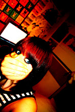
For my magazine advert I used the image from the right inside panel of the digipak. In order for it to fit into A4 dimensions i cropped the image, taking away her shoulder and some of the negative space on the left third of the image. With this the girls face takes up the centre and right thirds of the image, leaving the left third to hold information. I also copied the sand texture onto the image to keep up continuity and make the advert aesthetically pleasing. On a new layer I copied the NME logo from the website and modified it to get rid of any white background around the logo using the magic selection tool. I also copied a white star off of the internet with a black outline and modified it using the paint bucket tool to make it a matching red to that of the NME logo. I then duplicated the star four times and spaced them equally apart cantred above the NME logo. Above this i placed a quote to appear as though it was from NME magazine saying 'An andgelic voice. Not to be missed' and 'OUT MARCH 10th'. For both sets of writing i used relatively plain fonts as I wanted them to appear neutral, easy to read and to not draw too much attention away from the main title. The black font colour against the sandy background popped out well and made the information very easy to read. I centred these two pieces of text to keep the layout neat and tidy. For the artist and album title i used the same font styles and colours used in the digipak. I placed them at the top of the picture and made the artist name the width of the A4 page, this way it captures the audiences attention. I then placed the album title underneath this but slightly smaller so as to avoid cramping the piece, also as it is quite a short title if i stretched it to the width of the advert it may look over stretched and unnatural. So i placed it below with the same size font as the artist name and centred it beneath so as to keep the balance even on each side and to further give an overall 'neat' feel to the advert.
Question 2: How Effective is the Combination of Your Main Product and Ancillary Texts
As the song ‘Sail Away’ has a folk/pop feel I wanted to follow the conventions of the folk genre in my music video taking into account artists such as Tristan Prettyman and Jason Mraz. Therefore in my music video I focussed on creating a positive representation for the female artist in the music video by avoiding voyeuristic angles and using colour schemes and outfits that give a ‘pure’ and ‘innocent’ representation which would attract an aspiring audience.
With my ancillary texts I wanted to follow the positive representation created in the music video, I also created a strong brand image by using locations, outfits and colour schemes similar to within the music video that create a strong visual link that the target audience can identify.
In my digipak I used photography that focussed on the artist. Three of the four images were close ups of the artists face, this way I am promoting the artist’s image heavily to the audience proving that image and representation is an important aspect to the target demographic. There are two sets of photographs taken in two different locations; one set in the drama studio and one set in the bedroom. These locations were both used in the video so this strengthens the visual link and continuity between the two texts. Furthermore in the studio images the artist is wearing the same outfit that she wears in the performance element of the video, and in one image she is also sitting on the amp holding the guitar and suitcase found in the music video.
In my ancillary texts I used a sandy texture to create an earthy feel and to make them more aesthetically pleasing. In combination with this I maintained a colour scheme of natural pastel blues and sandy yellows, especially with fonts and flourishes. This gives indication to the beach theme created in the lyrics of the song; also it creates a very natural style which reflects the genre.
My font choices for both the digipak and magazine advert were deliberate in creating a personal feel that the audience would appreciate as they would feel a personal connection to the artist. The fonts used are script-like to make it appear as though the artist has written them herself. On the left outside panel there is a thank you message in the script-like font, this is a technique Kt Tunstall used in her album ‘Eye to the Telescope’. By using this technique I am following the conventions of the folk/pop genre, this increases the chances of the ancillary texts appealing to the target audience as they are already proven successful techniques.
Another technique I used to further personalise the digipak was through the use of personal art presented as though it has been hand drawn by the artist. This technique has been proven successful by the album ‘We Sing. We Dance. We Steal Things’ by Jason Mraz. I used drawings that once again fall into the beach category such as ice creams, seagulls and pebbles. This further reinforces continuity between the song, the video and the digipak and once again further personalises the digipak making it more appealing to the target audience.
On my magazine advert I created a comment plus five star rating from NME as NME covers a very broad range of artists and styles especially of the alternative genres. As folk is not a mainstream genre it is more likely to be recognised by an alternative ‘quirky’ music magazine. Also NME is a magazine that appeals to the target audience as they aspire to be ‘individuals’ and NME has the reputation of finding fresh new ‘individual’ artists and music styles such as Kate Nash, Friendly Fires etc.
I kept my magazine advert very minimalist by avoiding reels of text and using only one image being of the artists face. The image used is also found in the inside of the digipak; this once again increases continuity and links the three texts strongly together. I used a minimalist approach to tease the audience, it gives them little information but the aesthetically pleasing image will spur them to look further into the artist and her music.
Monday, 25 January 2010
Digipak Planning
 ngs, this will promote the artists image, and in this style it will promote it positively avoiding objectification. Also in the style of Tristan Prettyman's cover for her album 'Hello...x' I have placed the artist name and title beside her face as it will appear as though she is speaking her album title. The artist name may end up in another placing on the front cover if there is a lack of space and the two titles look cramped together, but the album title will stay in the planned area. The artist name will be written in a clear, printed yet delicate font to keep it easy to read but that will reflect the delicate feel of the artist and her music. The album title on the other hand will be in a font that appears hand written, once again adding to that personal feel, and will be decorated with a small hand drawn flower flourish, this will become a type of signifier throughout the digipak that will be found on most panels and would be something that would be used on future albums, adverts merchandise etc. to create an identity for the artist.
 y have an insight into the artists personal life, ultimately giving them the impession that they feel a stronger personal connection to the artist. This idea i took from the Jason Mraz album 'We Sing. We Dance. We Steal Things.' To further emphasise the impression that these drawings are the artists own thoughts I decided to use photo images of the artist at both the left and right, framing the drawings, these images will be one half of her head each on each side, therefore it will appear as though these 'thoughts' are streaming directly out from her head. This is the reason for the requirement of 3 panels, as they wouldn't fit well on a two panel digipak without the 'thought' section being separated by a fold crease. The CD will slip in a pocket inside the centre panel of the digipak. This way it won't corrupt any of the album art. On the CD there will be hand drawn flower flourishes like what will be found throughout the digipak, it will also contain scribbles much like those found on the inside of the digipak alongside the artist name and album title.
Upon revising my original pan for my digipak above i realised there were some mistakes in the layout that needed reworking, being the order of the panels on the outside cover of the digipak. As they were the front cover would be found on the back of the digipak and the extended image would be seen as the front cover, also the track listing would be the inside panel, this would be an unconventional way of presenting the digipak and wasn't what i had planned as i want to follow the layout conventions to avoid confuzing the audience and putting them off purchasing the album. I also scrapped the idea of the extended image for fear it wouldn't stand strong enough alone, also it wouldn't work with the conventional layout as with the track listings in the centre panel the two panels containing the image would be separated. So on the third panel i decided to have a photo of the artist 'behind the scenes' in the drama studio setting of the actual music video. This gives a greater variance and once again adds to the personalised feel that the audience will appreciate. Therefore below is the revised layout plan.

Upon revision i also decided to move where the actual CD will be placed in the digipak, it will now be placed in the centre panel of the inside of the digipak. As the CD has quite similar images to that on the centre panel of the digipak i have decided to keep the image exactly the same on the CD as it would be found on the centre panel, this way with the CD placed in the centre it will still show the same image as will be found when it is taken out of the case.

I also forgot to mention the overall theme/ colour scheme of the image although it is mentioned in the hand drawn plan. There will be an overall colour scheme, of sepia/warm sandy colours and pastel blues to link once again to the earthy naturalistic convention of the genre, it is also the colours of summer and the sea which once again ties the digipak artwork to the song. There will be a sandy texture on the digipak panels aswell to give further variance and generally a nice look to the digipak. This also prevents the panel with track listings from being too plain.