Saturday, 6 March 2010

Question 4: How Did You Use New Media Technologies in the Construction and Research, Planning and Evaluation Stages

All stages of the creation of my final media products in both AS and A2 media have been published online on blogger.com, which is a part of the Google enterprise. The advantage of using an online blog to publish all my work including research, planning, development of the construction process and evaluation is that my work is part of the web 2.0 community meaning that I have the possibility for the online community to access my work and I can achieve instant feedback and have a closer producer/audience relationship. This way I am constantly learning how my target audience perceive my work and constructive feedback/comments gives me the chance to take on their criticisms in order to go back and edit/update my blog posts. This is another advantage as by having all my work documented online I can access it from any computer anywhere in the world and be able to work on my posts without limitation; also the quality of the work doesn’t get damaged or lost as easily as it would if documented all on paper for example.

Other online sites I have used in publishing my work are YouTube and SlideShare. Through YouTube once again I am able to publish my finished product online for the YouTube community to be able to view from anywhere in the world with the chance to comment on my video, again giving me instant feedback and insight into my target audience. I can also embed my YouTube videos onto my blog making all my work centred in one place creating one whole package for the online community to view without having to travel around the internet through different links to find different parts of my work. With SlideShare I am able to upload Powerpoint presentations onto the internet and once again embed the presentation on to my blog; this gives variance to the way I am presenting my information, instead of always being simply typed essays on to my blog. It also makes the blog a more interactive experience for the users.

In the construction of my ancillary texts I used Dafont.com and Sxc.hu which are websites that contain unrestricted un-copyrighted high quality fonts, images and flourishes for me and anybody with access to the internet to download for our own personal use. Once downloaded I am free to edit the fonts, images however I like as the fact that they are unrestricted gives me the freedom to do whatever I wish with them. This is a fantastic way of creating a high quality amateur production that rivals the quality of expensive professional productions, although this does bring up the problem of no cost, no profit free content. Through the use of new media technologies and the accessibility of amateur productions, the future of professional productions could be threatened. If people can get similar products to what the professionals are making for free they aren’t going to be as willing to pay for the professional products that aren’t.

Whilst on the subject of high quality amateur productions there were a range of other new technologies that helped me to create my high quality main product and ancillary texts. For my ancillary texts the use of a 10mp digital SLR camera (Canon EOS 500D) gave me very high quality images that I could then go on to edit in Adobe Photoshop, an editing programme with an infinite amount of tools that can be used to create any image desired. I used tools such as layering, the magic brush tool, opacity alteration, the free transform tool, the eyedropper and paint bucket tool, the brightness/contrast tool, different filter tools and many more. The opacity tool helped me to create the sandy texture that every panel on my digipak has. Through the use of the eyedropper and paint bucket tools I have managed to keep the quality of my digipak to a high standard as they helped me keep the colour scheme constant throughout making sure the exact same shade of blue/yellow/brown was used on each panel. The free transform tool helped me to alter my flourishes so that they all looked unique and I avoided using the same ones over and over, this once again adds to the quality of the overall package and prevents the flourishes looking boring and over used.

Through the constant proliferation of digital software and hardware such as Photoshop and digital SLR cameras new products are coming out all the time making older yet perfectly proficient models very cheap and easily accessible once again adding to the idea that unprofessional productions can be of such a high quality. It also means anybody that wants to make an amateur video or image with access to the technology can easily come to grips with the software/hardware and grow in creativity and skill once again threatening the need for professional productions and people who work within this sector. To further back up this statement I can prove this through the technologies I used to create my thriller product and music video. For these I used a digital video camera (Canon MiniDv) that captures high quality moving images. It is lightweight with a relatively long battery life and is easy to carry around from location to location. Also I used the non-linear editing software Adobe Premier Elements, which much like Adobe Photoshop has a fantastic range of editing tools that with sufficient knowledge and practice can be used to make almost any effect desired. I used a wide range tools in the editing stage of my music video and although it took a long time and a lot of trial and error I managed to learn new skills and more about the software throughout the process. Tools I used included: the time stretch tool, resizing, the brightness/saturation tool, cross fades, advanced effects, the crop tool, titles and a lot more. Desired effects that I managed to create through these tools were the idea of panelling. With the use of the resizing tool and layering I could show three different sets of moving image in one frame which created this panelling effect. Another example is that through the use of time stretch I could make one clip fit into a desired time slot for instance the clip of the hand travelling down the banister would have been far too short to suffice on its own alongside a lyric unless I used the time stretch tool to slow it down to half speed. It also helped with speeding up the packing scene as without the time stretch tool this clip would have been far too long to use in the video and would have had to have been scrapped.

Finally, linking back to web 2.0 and the online community, through the fantastic reputation MySpace has built up for it’s unsigned band community I knew exactly where to go when I was told I needed to find an unsigned band to use for my music video. It’s not hard to know where to start when looking for unsigned bands on MySpace, on a famous bands page such as Jason Mraz there are plenty of similar unsigned bands in the comment section of the page often saying take a listen to our new track etc. And once again with the constant proliferation of new technologies these bands, even though being unsigned and unfunded, have access to the technologies that let them create high quality music tracks meaning it wasn’t hard at all for me to find an artist with music of a professional quality. Through the use of online network site MySpace I have managed to keep in touch with my artist giving her constant feedback on the work I am doing with her music, this once again shows how the online community brings together and personalises the producer/audience relationship and how much more personal online communities have made artist/audience relationships.
Although on the surface having access to these sites like Myspace and YouTube to create, produce and publish content seems like a great way to create cheap high quality products, we as a producer are not gaining the financial rewards that we could had we made the product from scratch. Effectively, Myspace is part of a conglomorate owned by Rupert Murdoch alongside media products: Fox TV, Sky TV, The Times and many others. (Equally, YouTube and blogger are the same, they are part of a conglomorate run by the owners of Google). Myspace is a new technology that creates a framework for the online public to take and build their content on, as we publish our new product onto the website it becomes a 'money maker' for them, the more popular the product gets the more 'hits' the site gets and the more hits the site gets the more money goes into the conglomorate's pocket. Originally in order for amateur filmmakers/musicians/etc to create the content they had to create the online vehicle but with Myspace and Youtube creating the vehicle for us they have made the process more accessible for amateurs making us feel more empowered as a producer to create high quality, high standard products that reach a large audience, this is clever as although it makes us feel more empowered in financial terms we are not. As Myspace and YouTube are simply websites that hold a framework and the users are making the content, the websites are very low maintanence therefore low cost to run as unlike 'The Times' they don't constantly have to update the website with new content, in a way we are the equivalent of the reporters and columnists of a newspaper, we are doing the graft and coming up with the stories but at the end of the month we aint getting no pay check!!
Why did Murdoch risk billions on buying these innovative new style sites when they didn't know whether the product would succeed or not?
Myspace was originally marketed as the main place for new unsigned bands, this attracted a young, creative and technologically savvy middle class demographic, and with the web 2.0 technology users could comment on each others products saying what they do and don't like about them, this gave a strong basis for the makers to learn who their target audience are and they immediately know where to market to and they can maintain the assurance that they are always targeting the right audience as trends change as they are constantly monitoring media consumption habits. The up to date interactive technology makes this an easy problem to tackle. Myspace's success and popularity has come from it's successful marketing to the right people which has led to them essentially monopolising the unsigned new music market, so although initially Myspace was a huge risk the pinpoint market focus has paid off and the popularity has led to them raking in the profits. Myspace was one of the first of these style websites to take the risk and in showing how successful it has been with the online community there has been a boom in online interactive networking sites and frameworks such as Bebo, Facebook, Twitter etc.

Sunday, 28 February 2010

Final Pieces: Music Video and Ancillary Texts

MAGAZINE ADVERT

OUTSIDE RIGHT PANEL (FRONT COVER)

OUTSIDE CENTRE PANEL (TRACK LISTING)


OUTSIDE LEFT PANEL (THANK YOU's)


INSIDE RIGHT PANEL


INSIDE CENTRE PANEL


INSIDE LEFT PANEL


VIDEO OF ANCILLARY TEXTS


MUSIC VIDEO

Wednesday, 24 February 2010

Ancillary Texts - Work In Progress


These are the original images for my ancillary texts.

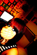
The first two images were taken up against the wall in the bedroom that was used in the bedroom scene within the music video. By using the same location for the music video and ancillary texts I am ensuring continuity, also this means there will be very similar lighting maintaining the same warm lighting effects in both the music video and ancillary texts. With this first image i flipped it vertically so that she was looking up to the left and used it as the right panel on the inside cover if the digipak.

The second image is located on the left hand panel for the inside cover. These would work as the two girls that frame the 'doodles' as shown in the planning/sketched ideas for the digipak. In order to strengthen these images i played with the brightness, saturation and contrast of the two images. To smooth the facial detail and make it almost seem as though the image has been sketched i used the 'dust and scratches' filter with a raduis of 14 pixels. But so as to avoid losing the detail on the eyes, earrings and lips i used a combination of the selection tool and layering to copy the original versions of these areas of the image to an above layer so that they weren't affected by the 'dust and scratches' filter. Then to ensure good quality i used the eraser tool on different strengths to tidy up any visible changes in texture between the two sets of images. To further perfect the images and to make the girl look more 'perfect' i used the clone stamp tool to copy clear areas of skin over blemishes and the bags under her eyes. Finally in order to follow the plan I initially created I cropped the images slightly

so just over half her face was visible on each image.

The following two images were for use on the outside panels of the digipak. This image is the image to be used on the front cover. I have pulled away from the original plan for my front cover and back panel as I thought it would be a better idea to keep the locations the same as the locations in the video for continuity and to strengthen the Ruth Bewsey 'brand'.

Therefor I took this image with the the front cover of Tristan Prettyman's album 'Hello...x' in mind. I liked the idea of personalising the album to the audience through the simple placemement of artist

name and album title in the direction of the artists mouth. So i took this image ensuring that the main detail was on the right third so that there would be room to place the artist name and title along the left and centre thirds. In order to smooth the image and increase the quality i once again played with brightness, contrast and saturation and used the clone stamp tool to perfect the skin quality. I also used a light filter to bring out the detail on the artists hair and face and to also dim the background so that the artists face was a strong centre of focus.

The image with the inclusion of the guitar, amp and suitcase follows the initial sketch/plan. I wanted to include props used in the video so as to increase continuity, also the guitar is an iconic image that the target audience aspire to.

The lighting in the drama studio was fantastic and made the quality of this image really good. The only problem i encountered was that by taking the image side on the dimensions did not fit the required dimensions of the 12.4x12.4cm panel and i really needed the main detail to be on the right third of the image so that the 'thank you speech' could be shaped around the left of the image. Therefore to fix this issue i had to use the clone stamp tool to draw the background across to the left, this was tricky as I had to draw in some of the suitcase and there was a huge risk of this looking badly photoshopped and clearly not real, so it took a lot of time and effort but with a lot of tweaking i managed to make the canvas fit the dimensions without stretching the image or damaging the quality. In order to make sure that the shading and warmth of the image was the same as that of the front cover i once again had to alter brightness contrast and saturation slightly.

These images are scans of the original hand drawn images that were to be used on the CD and in the inside centre panel. Once scanned in i opened the images up in photoshop and cut out each individual picture into a new layer. Once each in a new layer i took a sample of the yellowish background colour from the right panel with the eyedropper tool and with the paint bucket tool i filled in the white areas with this, i left some areas white as it gave the images a varying texture. Once i had done this with each image i could copy the layers on to the blank canvas that i had for the centre third and through the use of the 'free transform' tool i could resize and play with the angle/perspective of each image until they were framed on the page in a way i liked. This was probably the most time consuming part of the digipak making process but when it was done i think it worked perfectly.

I also used the flower flourishes across each of the outside panels, i altered the colour/opacity of them to fit each panel as
i wanted. This created an ongoing theme to the digipak.
Finally on every panel i used a sandy texture and altered the opacity of the image and placed it on the top layer on each photoshop file for each panel. This gave the digipak an earthy texture and also emphasised the natural/beach theme created throughout.


For my magazine advert I used the image from the right inside panel of the digipak. In order for it to fit into A4 dimensions i cropped the image, taking away her shoulder and some of the negative space on the left third of the image. With this the girls face takes up the centre and right thirds of the image, leaving the left third to hold information. I also copied the sand texture onto the image to keep up continuity and make the advert aesthetically pleasing. On a new layer I copied the NME logo from the website and modified it to get rid of any white background around the logo using the magic selection tool. I also copied a white star off of the internet with a black outline and modified it using the paint bucket tool to make it a matching red to that of the NME logo. I then duplicated the star four times and spaced them equally apart cantred above the NME logo. Above this i placed a quote to appear as though it was from NME magazine saying 'An andgelic voice. Not to be missed' and 'OUT MARCH 10th'. For both sets of writing i used relatively plain fonts as I wanted them to appear neutral, easy to read and to not draw too much attention away from the main title. The black font colour against the sandy background popped out well and made the information very easy to read. I centred these two pieces of text to keep the layout neat and tidy. For the artist and album title i used the same font styles and colours used in the digipak. I placed them at the top of the picture and made the artist name the width of the A4 page, this way it captures the audiences attention. I then placed the album title underneath this but slightly smaller so as to avoid cramping the piece, also as it is quite a short title if i stretched it to the width of the advert it may look over stretched and unnatural. So i placed it below with the same size font as the artist name and centred it beneath so as to keep the balance even on each side and to further give an overall 'neat' feel to the advert.

Question 2: How Effective is the Combination of Your Main Product and Ancillary Texts

When creating my main product and ancillary tasks I wanted to be sure of creating a strong ‘brand’ image and clear genre for my target audience.

As the song ‘Sail Away’ has a folk/pop feel I wanted to follow the conventions of the folk genre in my music video taking into account artists such as Tristan Prettyman and Jason Mraz. Therefore in my music video I focussed on creating a positive representation for the female artist in the music video by avoiding voyeuristic angles and using colour schemes and outfits that give a ‘pure’ and ‘innocent’ representation which would attract an aspiring audience.

With my ancillary texts I wanted to follow the positive representation created in the music video, I also created a strong brand image by using locations, outfits and colour schemes similar to within the music video that create a strong visual link that the target audience can identify.

In my digipak I used photography that focussed on the artist. Three of the four images were close ups of the artists face, this way I am promoting the artist’s image heavily to the audience proving that image and representation is an important aspect to the target demographic. There are two sets of photographs taken in two different locations; one set in the drama studio and one set in the bedroom. These locations were both used in the video so this strengthens the visual link and continuity between the two texts. Furthermore in the studio images the artist is wearing the same outfit that she wears in the performance element of the video, and in one image she is also sitting on the amp holding the guitar and suitcase found in the music video.

In my ancillary texts I used a sandy texture to create an earthy feel and to make them more aesthetically pleasing. In combination with this I maintained a colour scheme of natural pastel blues and sandy yellows, especially with fonts and flourishes. This gives indication to the beach theme created in the lyrics of the song; also it creates a very natural style which reflects the genre.

My font choices for both the digipak and magazine advert were deliberate in creating a personal feel that the audience would appreciate as they would feel a personal connection to the artist. The fonts used are script-like to make it appear as though the artist has written them herself. On the left outside panel there is a thank you message in the script-like font, this is a technique Kt Tunstall used in her album ‘Eye to the Telescope’. By using this technique I am following the conventions of the folk/pop genre, this increases the chances of the ancillary texts appealing to the target audience as they are already proven successful techniques.

Another technique I used to further personalise the digipak was through the use of personal art presented as though it has been hand drawn by the artist. This technique has been proven successful by the album ‘We Sing. We Dance. We Steal Things’ by Jason Mraz. I used drawings that once again fall into the beach category such as ice creams, seagulls and pebbles. This further reinforces continuity between the song, the video and the digipak and once again further personalises the digipak making it more appealing to the target audience.

On my magazine advert I created a comment plus five star rating from NME as NME covers a very broad range of artists and styles especially of the alternative genres. As folk is not a mainstream genre it is more likely to be recognised by an alternative ‘quirky’ music magazine. Also NME is a magazine that appeals to the target audience as they aspire to be ‘individuals’ and NME has the reputation of finding fresh new ‘individual’ artists and music styles such as Kate Nash, Friendly Fires etc.

I kept my magazine advert very minimalist by avoiding reels of text and using only one image being of the artists face. The image used is also found in the inside of the digipak; this once again increases continuity and links the three texts strongly together. I used a minimalist approach to tease the audience, it gives them little information but the aesthetically pleasing image will spur them to look further into the artist and her music.

Monday, 25 January 2010

Digipak Planning

Through researching the layout of cd packaging by similar artists i decided that i definitely wan't to use a cardboard digipak as opposed to the jewel case style packaging because i feel it reflects the earthy feel of the genre better, and i also think they are much more original than the jewel case and i personally find them more appealing.
I have decided upon the three panel style digipak mainly because of the idea i have for the inside panels. This idea is described below, and i feel it wouldn't work so well with a two panel digipak. Therefore for the front cover i decided to use a similar approach to the front cover of albums by artists such as Beth Orton, Tristan Prettyman and Colbie Calliat (these covers can be found in the collage on previous post). The front cover will be a naturalistic image of the artist in natural surroundings, this will promote the artists image, and in this style it will promote it positively avoiding objectification. Also in the style of Tristan Prettyman's cover for her album 'Hello...x' I have placed the artist name and title beside her face as it will appear as though she is speaking her album title. The artist name may end up in another placing on the front cover if there is a lack of space and the two titles look cramped together, but the album title will stay in the planned area. The artist name will be written in a clear, printed yet delicate font to keep it easy to read but that will reflect the delicate feel of the artist and her music. The album title on the other hand will be in a font that appears hand written, once again adding to that personal feel, and will be decorated with a small hand drawn flower flourish, this will become a type of signifier throughout the digipak that will be found on most panels and would be something that would be used on future albums, adverts merchandise etc. to create an identity for the artist.

This image will follow on onto the second panel so that when opened up the two panels create one elongated image. On the second panel will not be any part of the artist but it will just be a landscape image, personalised once again with the hand drawn flourishes. Hopefully due to the natural, earthy feel in combination with the genre convention it will be able to stand alone successfully as a single image taking up a whole panel. On the final panel will be the track listing, this will be kept simple with no photography to add variance to the view and texture of the digipak. But to avoid the panel being too simple the flower flourishes will be once again added to create a personal and naturalistic element.

For the inside of the digipak i decided to create a personal connection between the artist and the audience through the use of hand drawn cartoons, scribbles, phrases etc. including images that relate to the song 'Sail Away'. These will be presented as the artists own and as if they are snippets of her own personal thoughts., this makes the audience feel as though they have an insight into the artists personal life, ultimately giving them the impession that they feel a stronger personal connection to the artist. This idea i took from the Jason Mraz album 'We Sing. We Dance. We Steal Things.' To further emphasise the impression that these drawings are the artists own thoughts I decided to use photo images of the artist at both the left and right, framing the drawings, these images will be one half of her head each on each side, therefore it will appear as though these 'thoughts' are streaming directly out from her head. This is the reason for the requirement of 3 panels, as they wouldn't fit well on a two panel digipak without the 'thought' section being separated by a fold crease. The CD will slip in a pocket inside the centre panel of the digipak. This way it won't corrupt any of the album art. On the CD there will be hand drawn flower flourishes like what will be found throughout the digipak, it will also contain scribbles much like those found on the inside of the digipak alongside the artist name and album title.


Upon revising my original pan for my digipak above i realised there were some mistakes in the layout that needed reworking, being the order of the panels on the outside cover of the digipak. As they were the front cover would be found on the back of the digipak and the extended image would be seen as the front cover, also the track listing would be the inside panel, this would be an unconventional way of presenting the digipak and wasn't what i had planned as i want to follow the layout conventions to avoid confuzing the audience and putting them off purchasing the album. I also scrapped the idea of the extended image for fear it wouldn't stand strong enough alone, also it wouldn't work with the conventional layout as with the track listings in the centre panel the two panels containing the image would be separated. So on the third panel i decided to have a photo of the artist 'behind the scenes' in the drama studio setting of the actual music video. This gives a greater variance and once again adds to the personalised feel that the audience will appreciate. Therefore below is the revised layout plan.


Upon revision i also decided to move where the actual CD will be placed in the digipak, it will now be placed in the centre panel of the inside of the digipak. As the CD has quite similar images to that on the centre panel of the digipak i have decided to keep the image exactly the same on the CD as it would be found on the centre panel, this way with the CD placed in the centre it will still show the same image as will be found when it is taken out of the case.


I also forgot to mention the overall theme/ colour scheme of the image although it is mentioned in the hand drawn plan. There will be an overall colour scheme, of sepia/warm sandy colours and pastel blues to link once again to the earthy naturalistic convention of the genre, it is also the colours of summer and the sea which once again ties the digipak artwork to the song. There will be a sandy texture on the digipak panels aswell to give further variance and generally a nice look to the digipak. This also prevents the panel with track listings from being too plain.

Tuesday, 5 January 2010

How our video is designed to appeal to the audience

How costumes, props, idea and actors would appeal to the target audience.

This music video is targeted towards a demographic of both males and females aged 15-25. I think the idea created for the video reflects the youth of today but it also represents change, which is something people of the target demographic go through a lot at their age that is beyond their control for instance the idea of independance is quite scary, with the thought of leaving the safe confines of school and being thrown into the real world with no real support or guidance. The video is a light hearted way of showing that change doesn't have to be scary, it can be fun, exciting and uplifting. From the video the target audience may feel they can take inspiration and that by looking at change from this point of view life can be a little less scary, they can see it as more of an adventure.

The folk genre is all about telling stories, as that is how it originally came about - telling stories in the form of song. But it is also also about the raw music in its simplest form, not using gimiks such as auto tuners, synthesizers etc. Therefore the idea of using a performance narrative alongside a linear story narrative gives the two different elements that the genre represents. Although music videos often use this convention, music of the folk genre and similar genres tend to not have their performance element in such a structured location as a studio, they are often found playing in casual, relaxing locations such as the bedroom, eg. Tristan Prettyman - Madly, Missy Higgins - Where I Stood. A set up like that of our music video is similar to videos such as Kelly Clarkson - Since U Been Gone, Paramore - Misery Business, 30 Seconds to Mars - Kings and Queens. This shows that the set up is used throughout a wide range of genres from pop to rock. Therefore maybe using this layout will grab the attention of the target demographic better especially people who fall into this demographic that wouldn't usually be attraced to the genre as they may be attracted to the variance.

Freya was chosen to represent Ruth as she has similar characteristics to the actual artist. She is pretty, petite, and feminine, this is something that i also would relate to the voice had i never seen the artist as it is a 'pretty', delicate voice. Casting someone who is pretty and feminine will hopefully attract the target demographic as she is easy on the eye for the male viewers, and something the female viewers will be attracted to in a sense of idolisig or comparing, effectively someone they aspire to be. The choice of clothing for this character reinforces this idea, as the clothing is all attractive feminine and appropriate, complimenting her figure without showing a lot of skin to prevent making her body the main focus yet still emphasising her beauty.
The casting for the guitarist wasn't quite so important as the camera isn't often focussed on the character. Therefore the main aim was to choose someone reliable, but so as not to alienate them casting someone of a similar age seemed the most appropriate therefore Cameron was casted. This way even though he is not focussed on very much, a viewer who is interested in the guitar will be scrutinizing this character or aspiring to him, therefore a good image is crucial. He was casted with a grey t-shirt and jeans so as to look casual and comfortable in his surroundings, the song is about being laid back and this image reflects this.

Props affect the appeal of a music video, for instance certain brands of mobile phone are often used in music videos (for instance in Fall Out Boy's music video, 'This Ain't a Scene It's An Arms Race) to show the status of the artist, to promote the phone and also if the viewer idolises the artist they are watching they are most likely going to want the phone in the video so that they have as similar image to the artist as possible, ultimately making them feel accomplished and in style. In the music video for Sail Away the main props used are:- an amp, a microphone, an acoustic guitar, a stool, and a suitcase. These are not so much about image and status, they are simply essential props to both a performance and to the story narrative, but nontheless they still affect the audience somehow. In order to appeal to the target demographic a modern suitcase is used, as an old fashioned suitcase may alienate the audience slightly, and it would also clash with the image given to the main character. The acoustic guitar is an essential instrument to the genre, it is also a very popular instrument with young and budding musicians today therefore alot of the target audience will be able to relate to this. The stool is simply used to give the guitarist a comfortable position to play, and it also emphasises the casual, laid back feel to the performance, this simply adds to the viewer feeling at ease from the mood created by the atmosphere on screen. The microphone and amp are used to give realism to the performance element, without them the balance would be thrown off and the scene would not be quite so aesthetically pleasing for the viewer, the veiwer would also get the sense that the performance is simply a farce, so by using these props we are avoiding this from happening. Also the amp is a 'Marshall' amp which is a very popular brand, the viewer may notice this and get the impression that because upmarket brands are being used, this artist is modern and stylish and therefore it would be 'cool' to be a fan of the artist and their music, as today with people within my target demographic, style and the way you present your image means a lot within society and if the artist didn't give off this impression that they are stylish it may put off a lot of the target audience.

The animation at the beginning of the video is used as an enigma to entice the viewers. The idea of a pile of clothes growing on the bed followed by a paper boat sailing over the top of them gives the viewer a taste of what to expect within the video, it gives a hint at what both the song and the video is about without the viewer realising, they won't understand this until the end of the video hence the idea that they will have to watch up until the end to work out the enigma set at the beginning. This quirky technique is being used more and more often in music videos today as technology is getting more and more accessible, for instance in videos such as 'Beneath the Rose' by Micah P Hinson. I think this technique will captivate the target audience because it is not music video style they will be used to seeing as most videos they view that are in the charts at the moment are very conventional, and don't often use complicated or unusual techniques for the rick of their audience rejectiong or not understanding whats happening on screen.

Wednesday, 30 December 2009

Digipak Reviews and Planning

Using the internet I have found a selection of CD and digipak covers from similar folk/alternative artists that link to my artist and her style of music. I did this instead of looking around for interesting digipak formats so that I could understand what style of cover art and what form of packaging is often used to represent the genre. Here are the covers I found.


Without looking at the format in which the albums come in and focussing entirely on the cover art and putting them all in a collage like this I can clearly see a pattern emerge in the styles. The majority of the images have a very warm, earthy colour palette or the images represent nature and the earth for instance the moth on the Ani DeFranco album ‘Evolve’ which is pictured third down on the left. Another example is Poi Dog Ponderings self titled album (two across from the Ani DeFranco album) which pictures an abstract cartoon image of a tree with skeletons representing the roots and trunk of the tree, also on the image there is a drawing of an eye, other flowers, a bird and a human silhouette.
16/27 of this selection of cover art contains the artist on the cover, showing that the majority use this to promote the image of the artist as opposed to art reflecting their music. This may be something to consider when planning my digipak, although from looking at these images I personally find the covers not focussing on the artist are much more interesting and aesthetically pleasing, this is also something to consider.


For my artist I am aiming towards creating a form of digipak as opposed to the bog-standard jewel case because I feel a digipak is much more exciting with the potential to be a great keepsake and something that can be much more personal to the artist making the consumer feel as though from purchasing this they have purchased a special part of the artists mind, and it is just generally far more artistic. This digipak for Imogen Heaps album ‘Speak for Yourself’ I think has a combination of good and bad points that I can learn from. For instance, I don’t like how heavily the album promotes the artist with every cover consisting of an image of her. But what I do like about the digipak is the colour scheme and how it reflects her music. The front cover is mainly white but it contains lots of colourful pink, yellow and blue spots surrounding the cartoon image of her, and this is similar on the CD but with horizontal lines as well as spots. This keeps the picture crisp and clean yet upbeat, this reflects the fresh feel-good and optimistic feel of her music. Then the back cover contains a red/pink/yellow colour palette and gives a very warm feel, it reminds me of a sunset, in a way this also reflects her music as it is soothing much like a sunset. All so a sunset represents the end which I like as the back cover is literally the end of the digipak. The one thing I like most about this digipak though is the way the booklet is held. The front cover of the booklet is a picture of Heap riding a bike, once again the colour scheme is very warm, but I like the way it is slotted into the cover and together they make a bigger image revealing more of the bike.


This is another digipak, for the album ‘We Sing, We Dance, We Steal Things’ by Jason Mraz. This digipak is quite different from the previous. Firstly the colour scheme is entirely black and white, there is no photography included at all. All images are hand drawings created by the artist himself. This puts a personal spin on the album that I think the consumers would appreciate as it makes them feel they have a personal insight into the artist’s life and mind. There is also a limited edition version of the album containing a bonus CD and DVD containing 10 of the albums songs unrefined when they were originally recorded for an EP including other songs that didn’t make the album, the DVD contains his full live concert, and these extras give the consumer an even deeper personal touch. The hand drawn cartoons and sketchy writing I think reflects Mraz’s music perfectly, it’s very quirky, cheeky and raw as is his music. The front cover is extremely simple which not many artists could pull off, but it works solely for the fact that his music has enough personality that the album doesn’t need a complex design to make up for any lack of. What this digipak tells me is that in order to make it successful it needs to show the artists personal style as closely as possible.


This is the digipak for the album ‘Hello…x’ by Tristan Prettyman. This artist I find most similar to my artist with a very similar voice and music style. The digipak for this album is very simple and straightforward, there are no quirky personal aspects like there is in the Mraz album, but nonetheless it works. I like how simple and neat the back cover is, a plain blue background with a very plain font used for the song titles which are placed neatly in the left third of the cover with a margin – much like a list as it would be seen typed out on a word processor. The front cover, even though it uses a cool blue for its background and black and blue fonts, it doesn’t give off a ‘cold’ feel as I would expect with this colour scheme. The warmth is given to the cover through the placement and expression of the artists face, a simple trick. She appears entirely at ease and natural which warms the cover. I like the way different colours are used for the artist name and album title while they are of the same font and size on the same line, it adds to the crisp, simple and uncomplicated feel of the digipak. I also like the way it is placed next to her mouth, as if she is literally saying ‘Hello’. Once again there is a margin on the left the same width as with the back reverse cover, this simply emphasises the neat organised theme. Again the simplicity is shown through the actual CD, pure black with ‘Hello…x’ written on it in the same font, size and colour as it is on the front cover. On the cover where the CD is pulled out from there is an image of the artist once again, her head is almost completely cut off, but her arm reaches up from the bottom right towards the top left corner of the cover, in this position it looks like her arm is reaching for the ‘Hello…x’ on the CD which is tucked behind but slightly visible where the CD peeks out of it’s slot. This once again attaches her person to the words being said, like with the front cover. I like the idea of the visual attachment between the artist and the words.